Redesigning prescription platform used by 6,000 doctors
Medtech startup needed to redesign their core product to better serve doctors' workflows. The product was hard to use and was more time-consuming than traditional solutions. Through user research analysis and iterative prototyping, I redesigned the information architecture around a central card concept and introduced smart search and filtering. The solution was approved by senior team and is about to be tested with doctors.
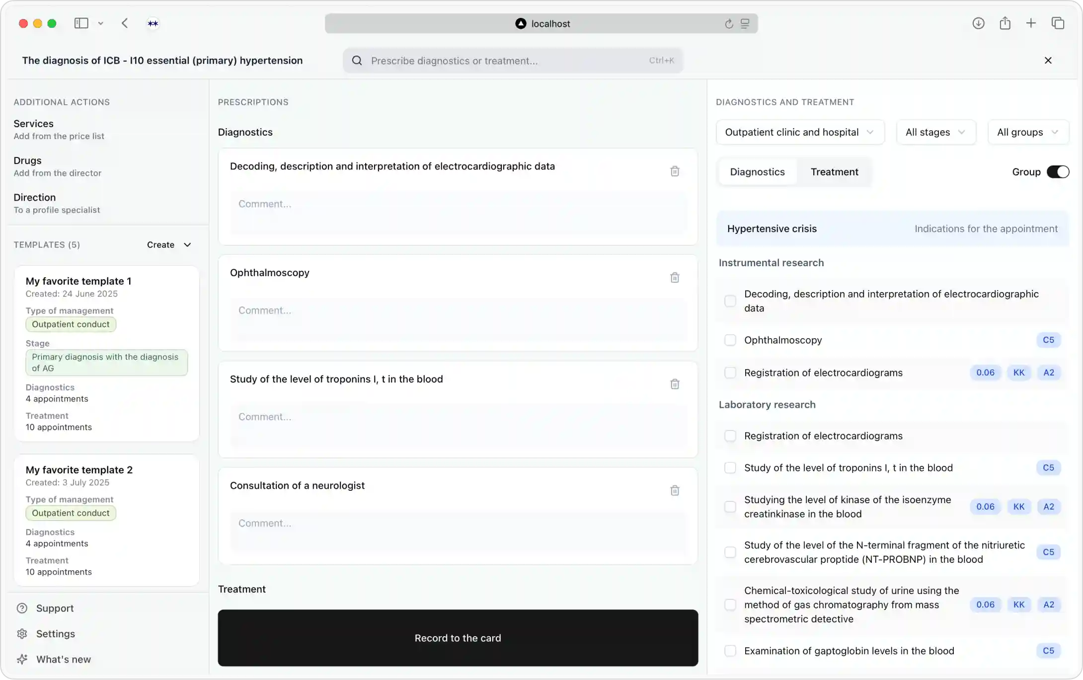
- my role: defined information architecture, coded interactive prototype
- team: me, 1 product owner
- year: 2025
- timeline: 2 weeks
- deliverable: interactive prototype ready for testing with users
Problem to solve
Key issues:
- Too many clicks for basic tasks—doctors want "couple of clicks" max
- Faster to prescribe from memory than to use current product
- Difficult treatment search and selection process
- Multiple windows, slow workflow—no time to navigate between screens
Solution
Success criteria: reduce clicks to target action and increase speed of work.
With that in mind, I redesigned the entire information architecture around a one-window concept with:
- Central card interface for primary actions
- Smart search and filtering for quick access
- Clinical recommendations are prominently positioned
- Templates and tools accessible from sides
This how the interface looked before
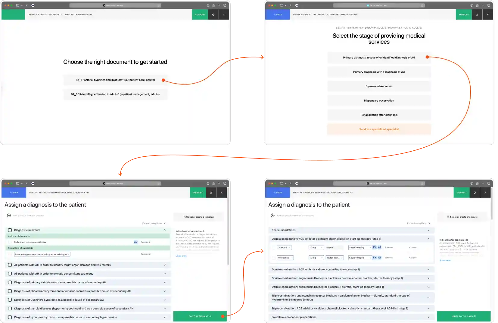
Before: several steps and many clicks
And this is what we ended up with
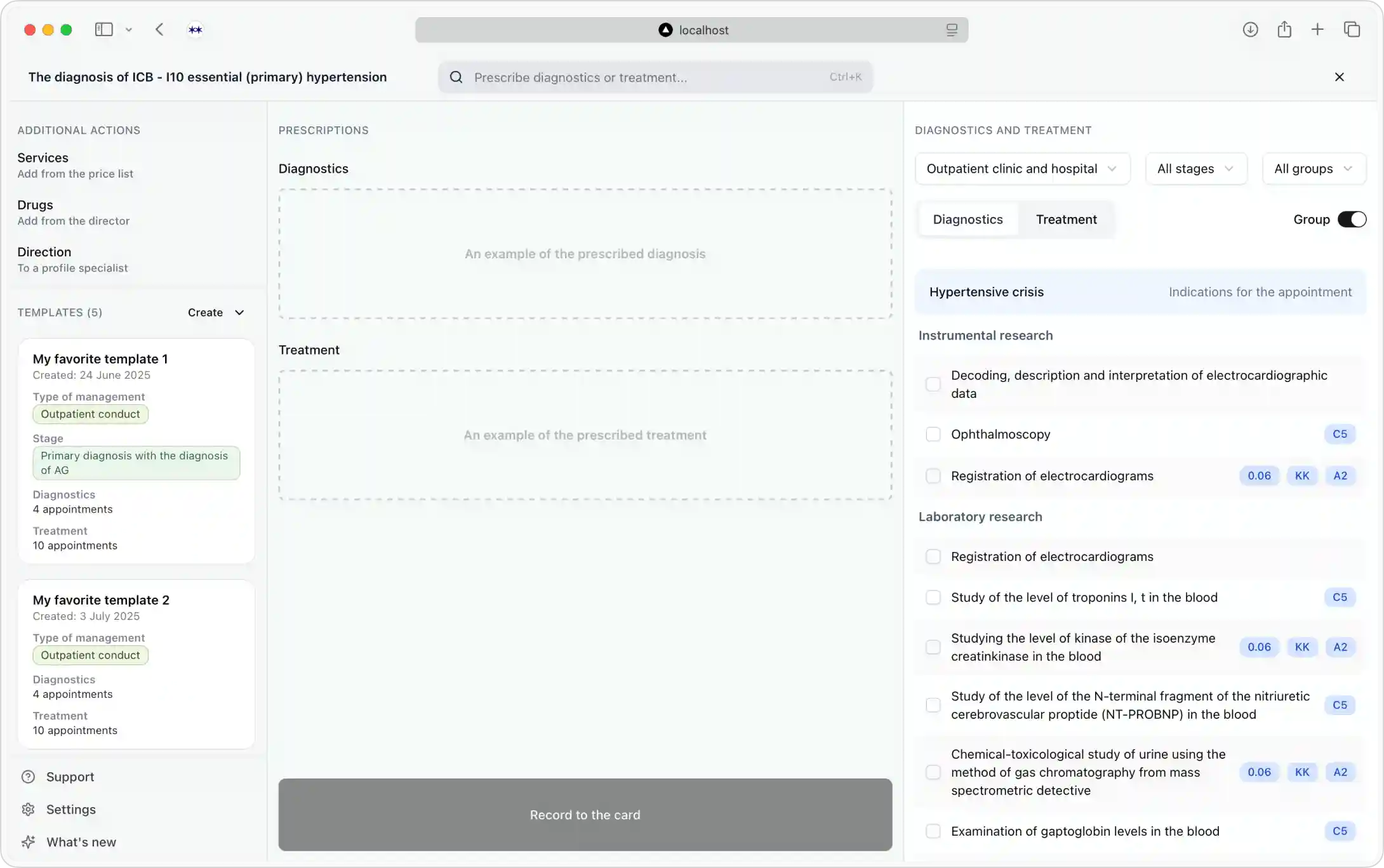
After: everything within one window
Process
I started with auditing current and previous versions of the product. It is blurred for privacy reasons, but you can see blue and red blobs. These are my questions about why certain things work like that. Result: I understand how the product works.
User journey analysis in the old product
The team had already run user research to collect feedback about the current product. The anonymous survey holds feedback from doctors using product daily: how often they use it, what they like, what they don't like. Analysing the document gave me an understanding of the most burning issues (listed in "Problems" section).
After digesting all this information I suggested the new foundational logic: "When a doctor opens our product, they already have treatments/diagnostics in mind. We should allow them to add items straight away."
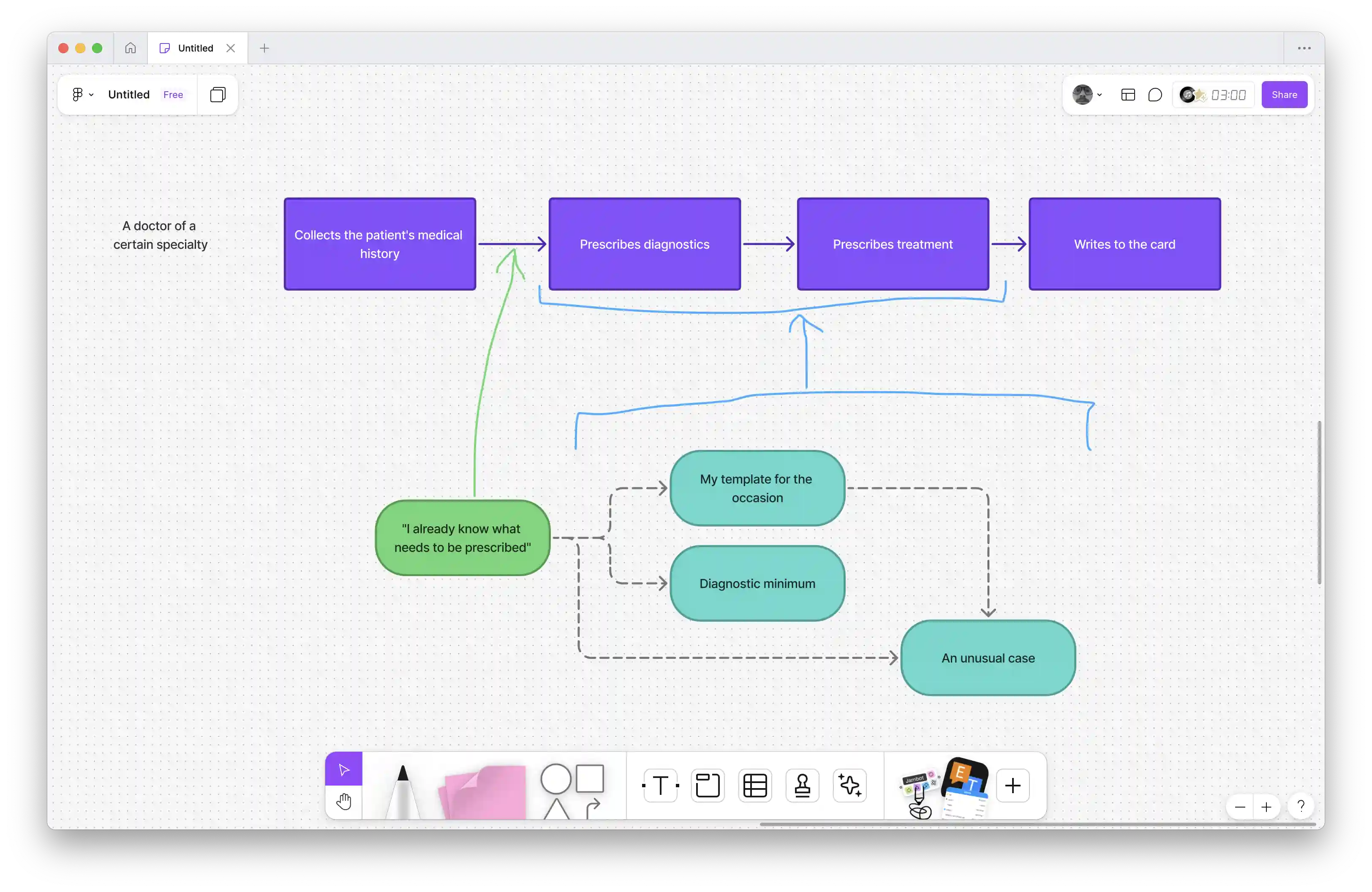
Process of prescribing
Implementation-wise, my process looked like this
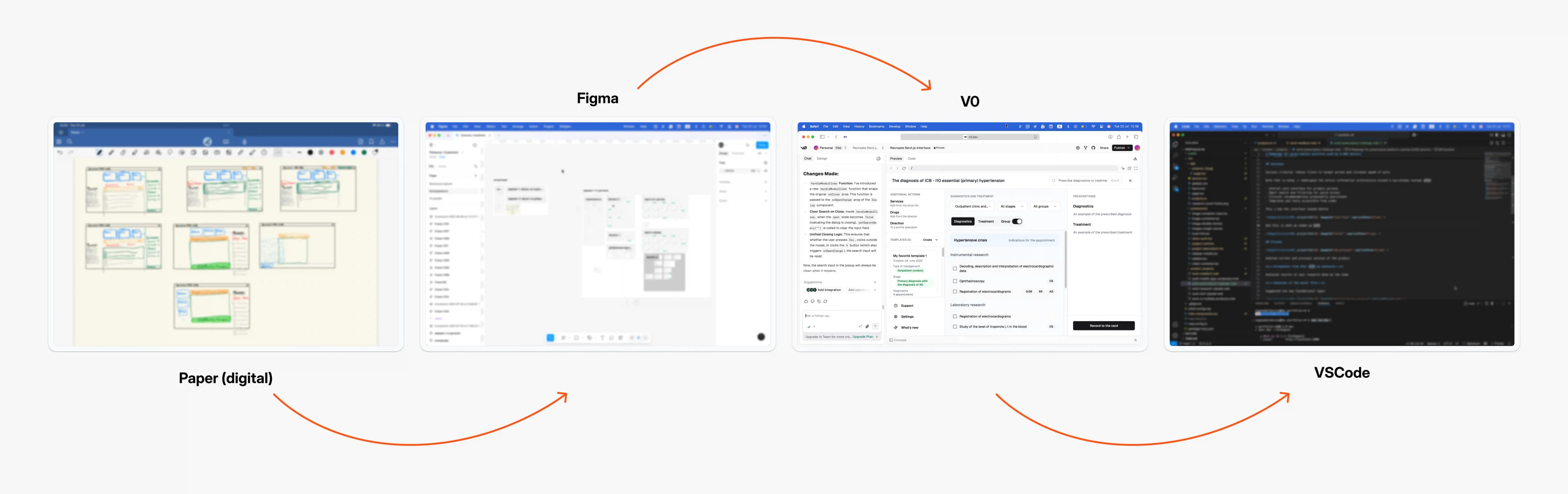
From ideation to working prototype
This is how the new product will be structured. Key sections:
- Functional sidebar. Here live most importantly templates and all secondary actions, they might be useful but are secondary nevertheless.
- Section where you add prescriptions. The key part of the interface. Here, doctors adds what will be prescribed to a patient.
- List of all diagnostics and treatments. When necessary, a doctor can consult with all the diagnostics and treatments recommended based on the condition of a patient.
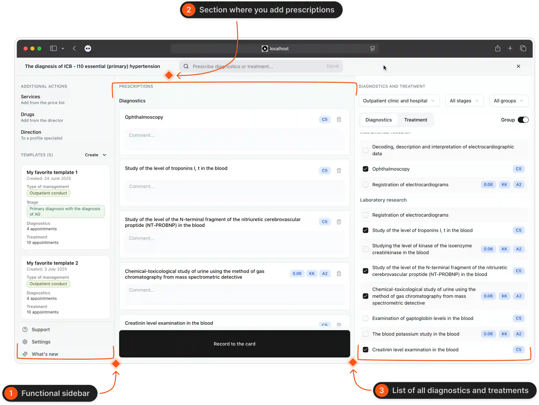
Main parts of the interface
There are three ways to add prescriptions.
You can manually select from the sidebar on the right-hand side.
Or use shortcuts and search bar. This feature is based on the hypothesis that in most cases, doctors already know what they are going to prescribe when they open this product.
Or you can use template for the most common cases.
Results
- Senior team buy-in: Approved innovative approach despite initial conservatism
- User-testing ready: Interactive prototype delivered for development