Design that builds trust between doctors and AI
I helped early-stage medtech startup to redesign one of their core products. The company built proof of concept using no-code tool and was ready for the next step. I joined the team to identify usability issues and make the product look smart and trustworthy. With insights from doctors and the team, I rebuilt the product from the ground up: new information architecture, explanations of AI recommendations and new visual language. As a result, I delivered an interactive prototype using Next.js.
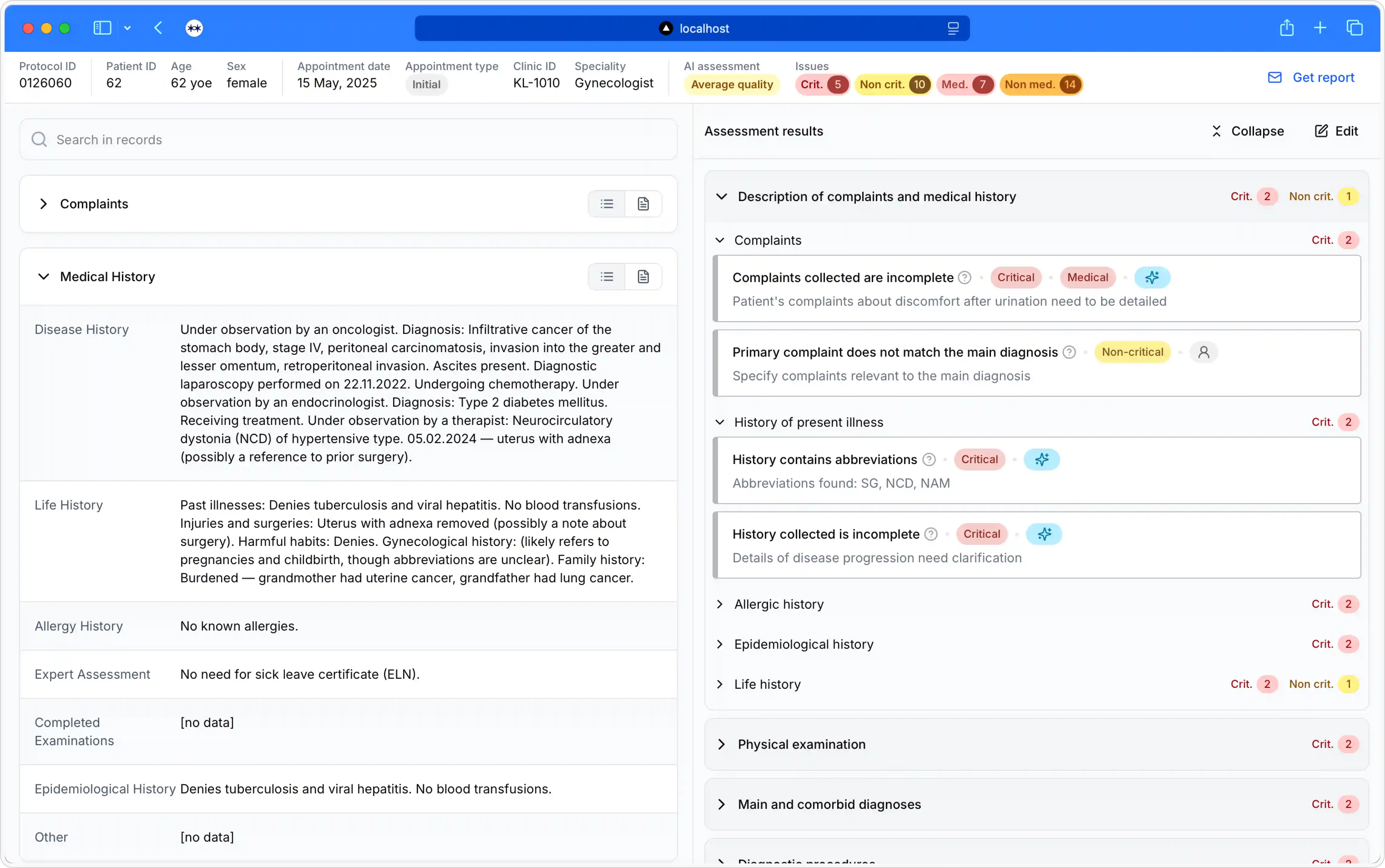
- my role: run user research, designed wireframes, coded interactive prototypes
- team: me, 4 doctors, 1 ML engineer, 1 product owner
- year: 2025
- timeline: 4 weeks
Product
Imagine a private hospital or clinic. Every doctor appointment results in patient notes. These notes have to comply with both government regulations and internal rules. If a doctor fails to provide a correct diagnosis, it may result in incorrect treatment, fines from an insurance company, lost profit and even criminal charges.
To prevent that, clinics implement quality assurance practices. Usually, about 10% of all notes are assessed, manually. This results in missed errors and a cumbersome process of tracking the doctors’ performance.
This is where the product comes in. It analyses 100% of all protocols across 300 parameters, ranging from ones impacting treatment to formatting issues.
Problem
- Information architecture issues. Key information missing or hidden,
- Non-actionable AI recommendations. With AI labels like “good quality” or “critical quality”, doctors didn’t know how to prioritise notes to be looked at.
- “No code builder” style and accessibility issues. The visual style became a problem on sales calls. On top of that, doctors complained about small font sizes and being overwhelmed by the interface.
Solution
Dashboard before and after
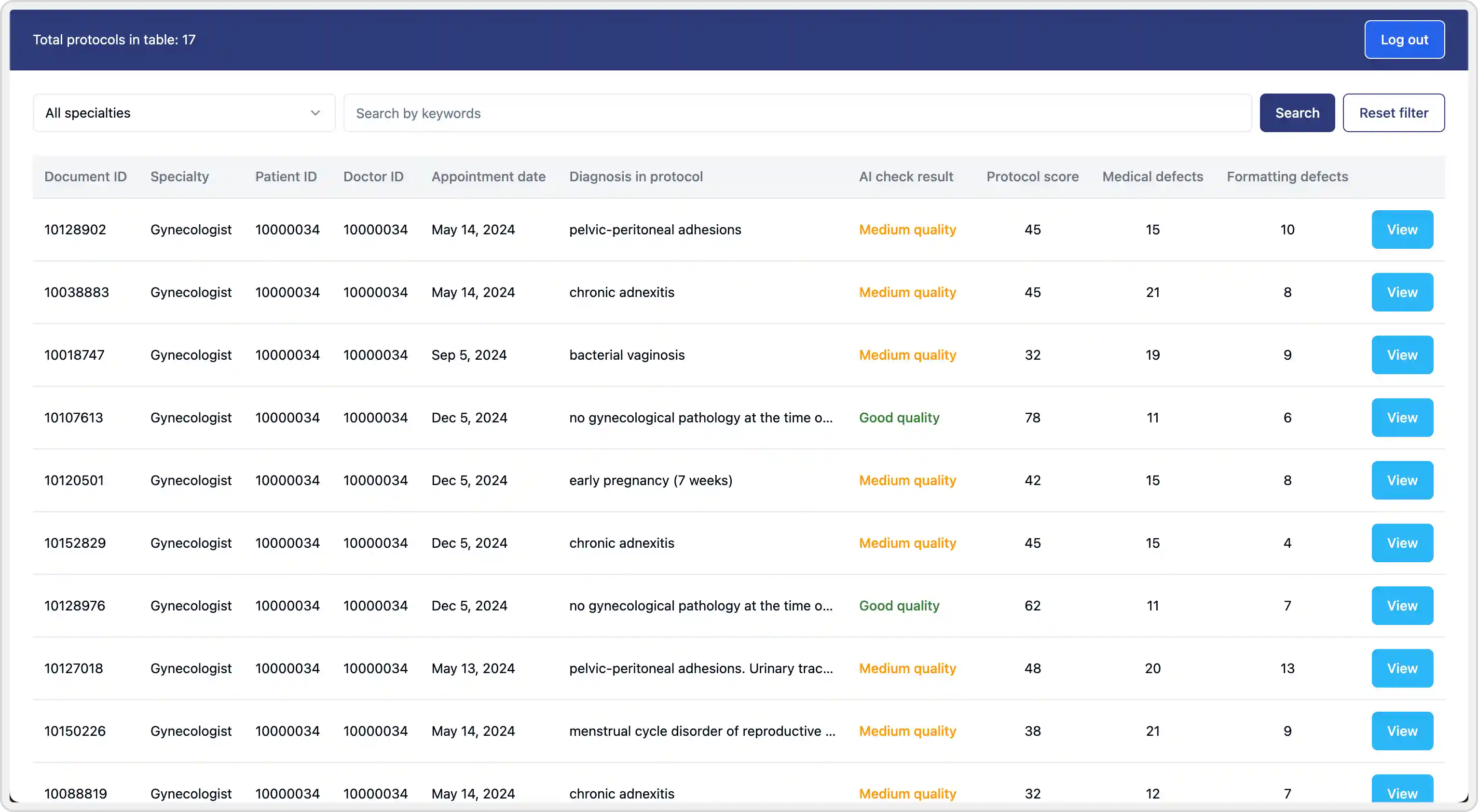
Dashboard before
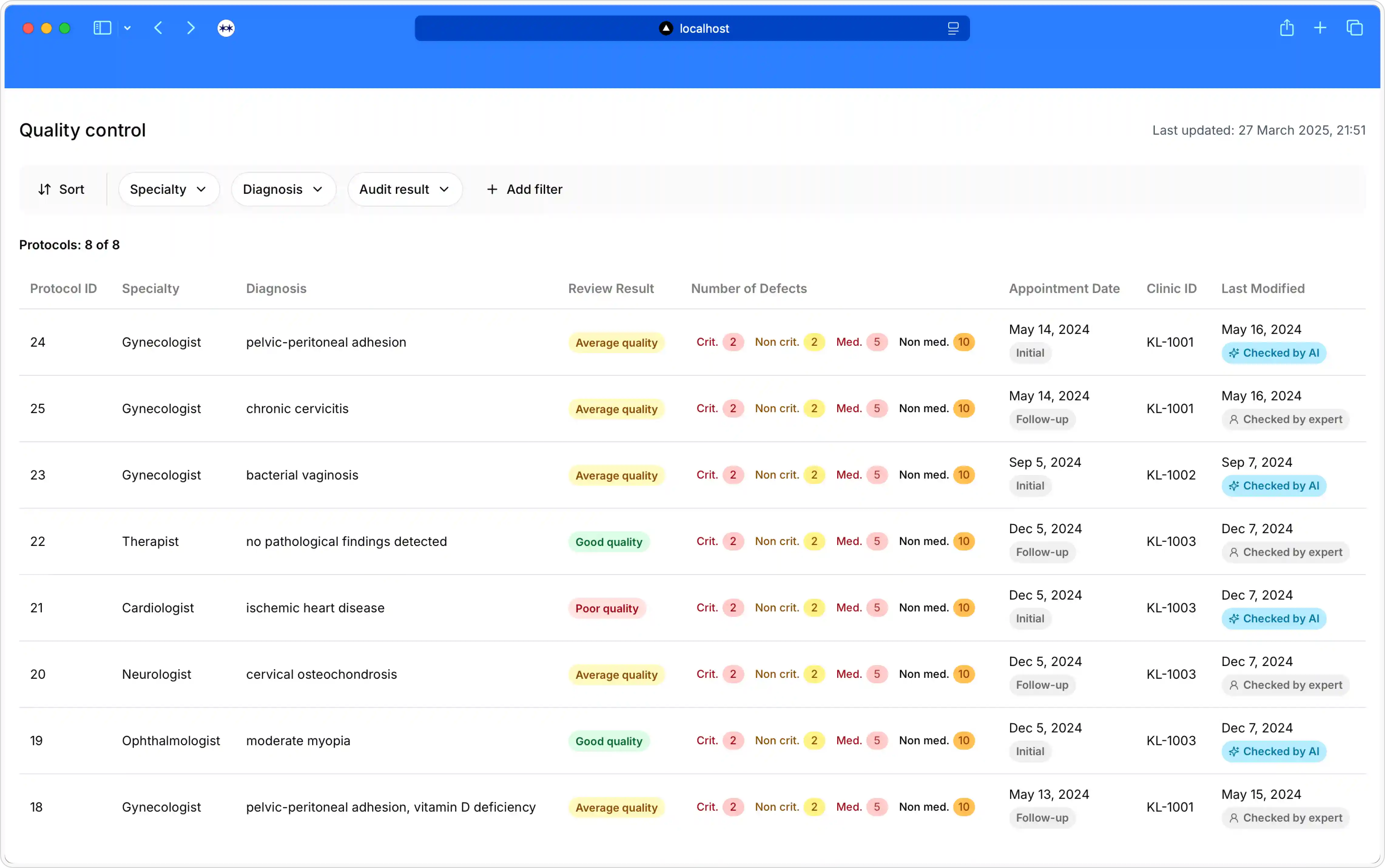
Dashboard after
Patient notes before and after
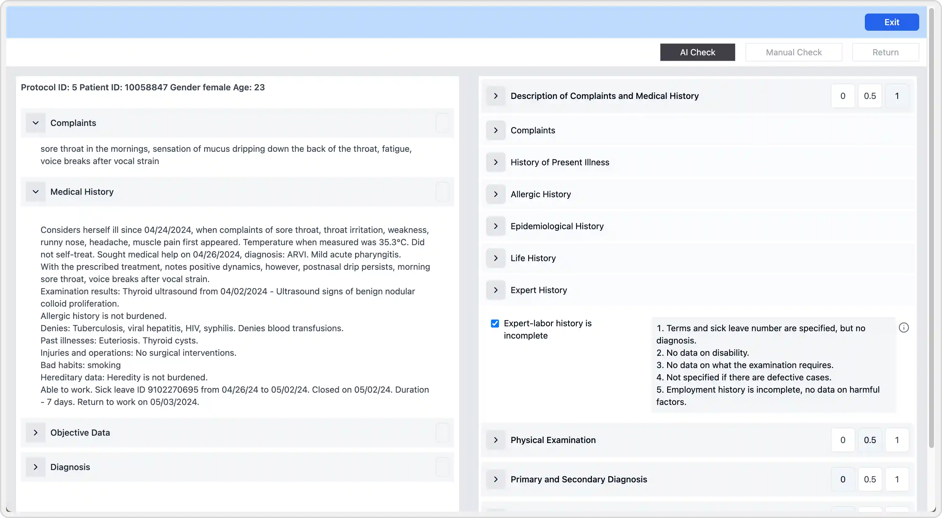
Patient before
Patient after
Metrics
We settled on tracking the “trustworthiness” and a number of new deals closed.
Why this solution
I have run interviews and closed card sorting research with doctors to gather insights and decide on information architecture.
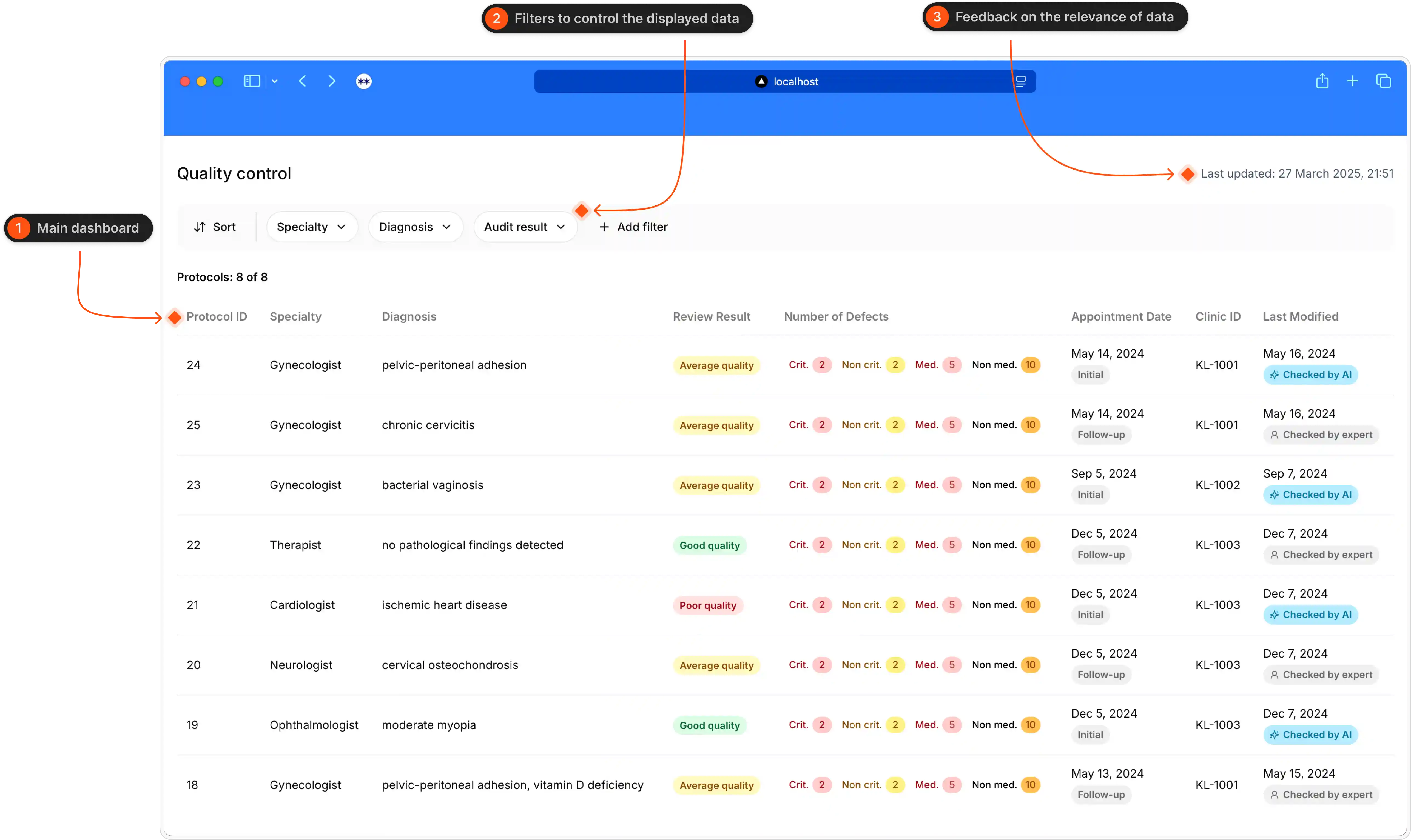
Structure of the dashboard
Here is the video
The most used filters are always displayed. Doctors get feedback about the number of records.
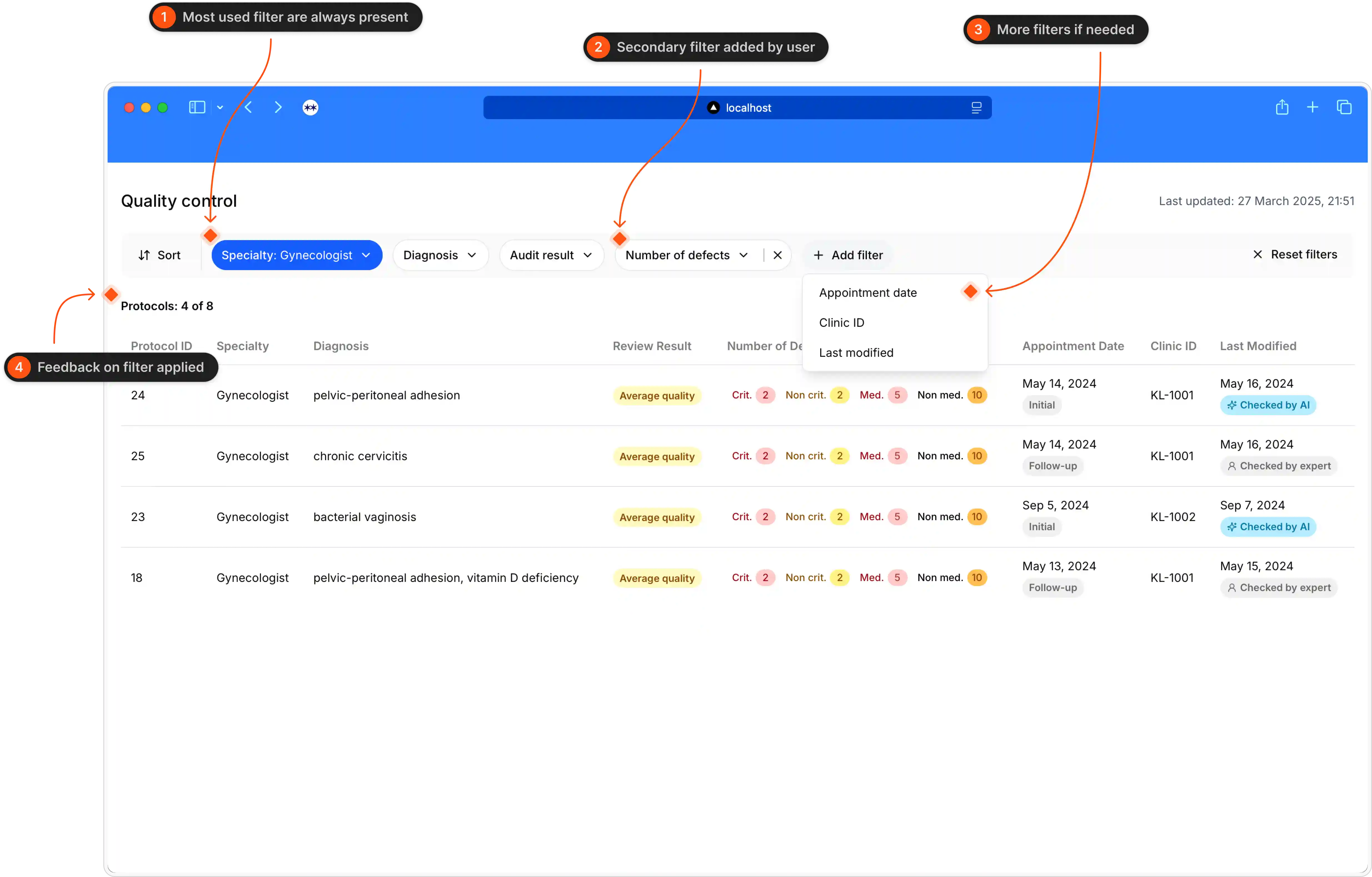
The logic of the filters
Structure of the protofol page: header with key info, original notes from the assesment, AI feedback
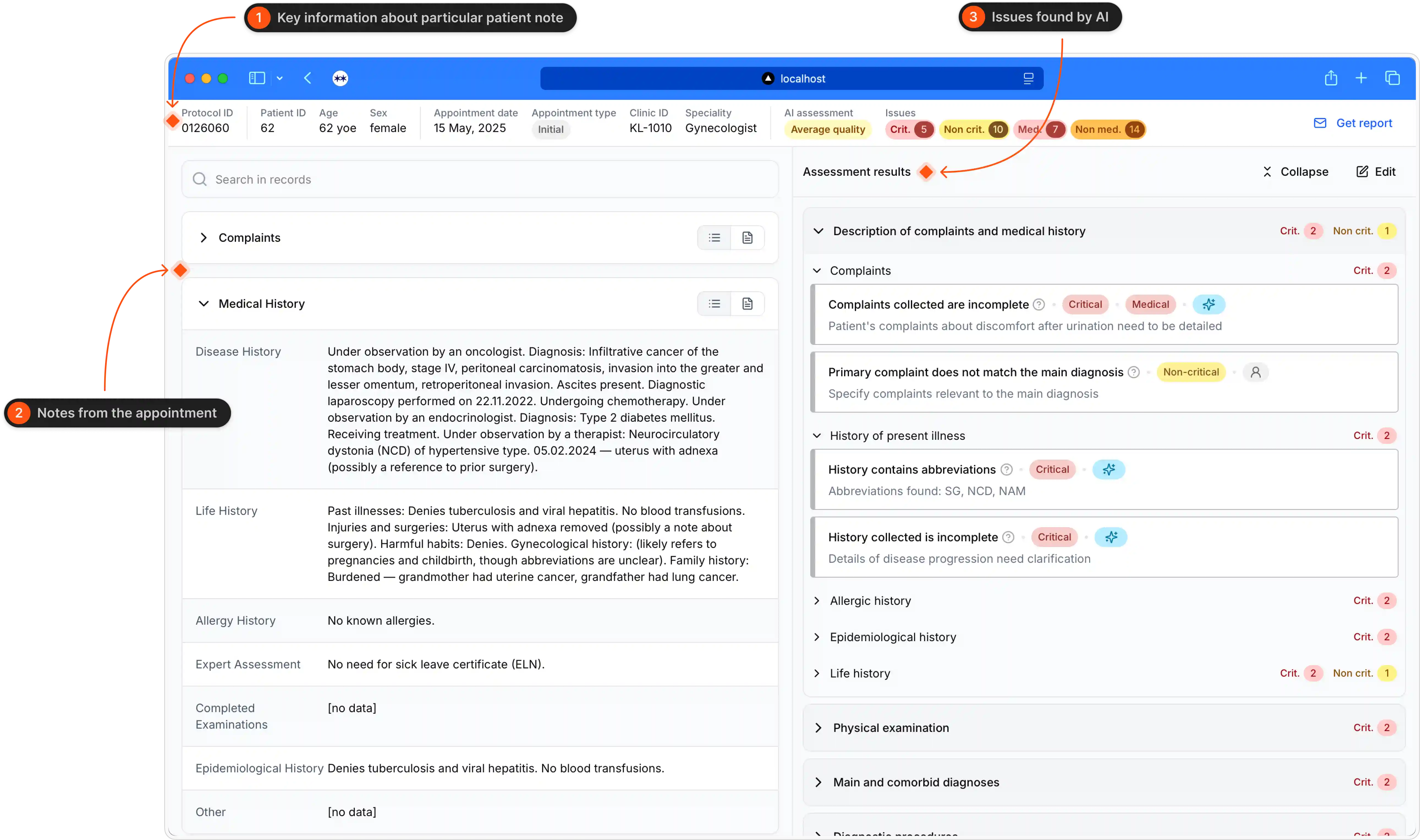
Structure of the protocol page
The header was redesigned based on a card sorting exercise: doctors had to prioritise what information should be available immediately, could be one+ click away or unnecessary.
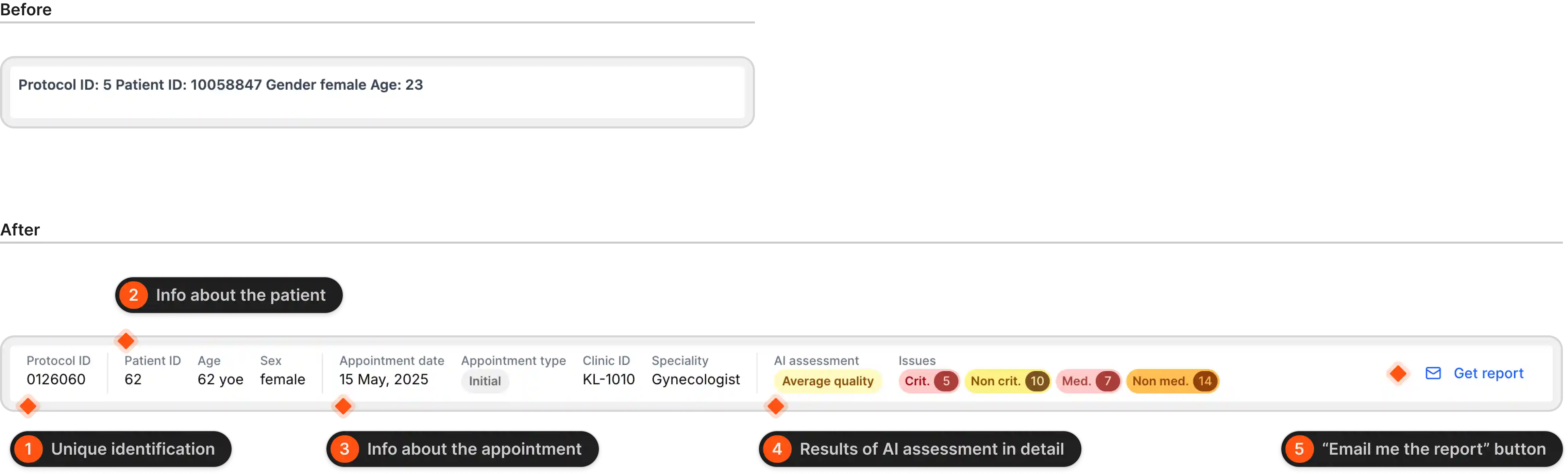
Header before and after